
Common Accessibility Mistakes in Frontend Apps
And what to do instead

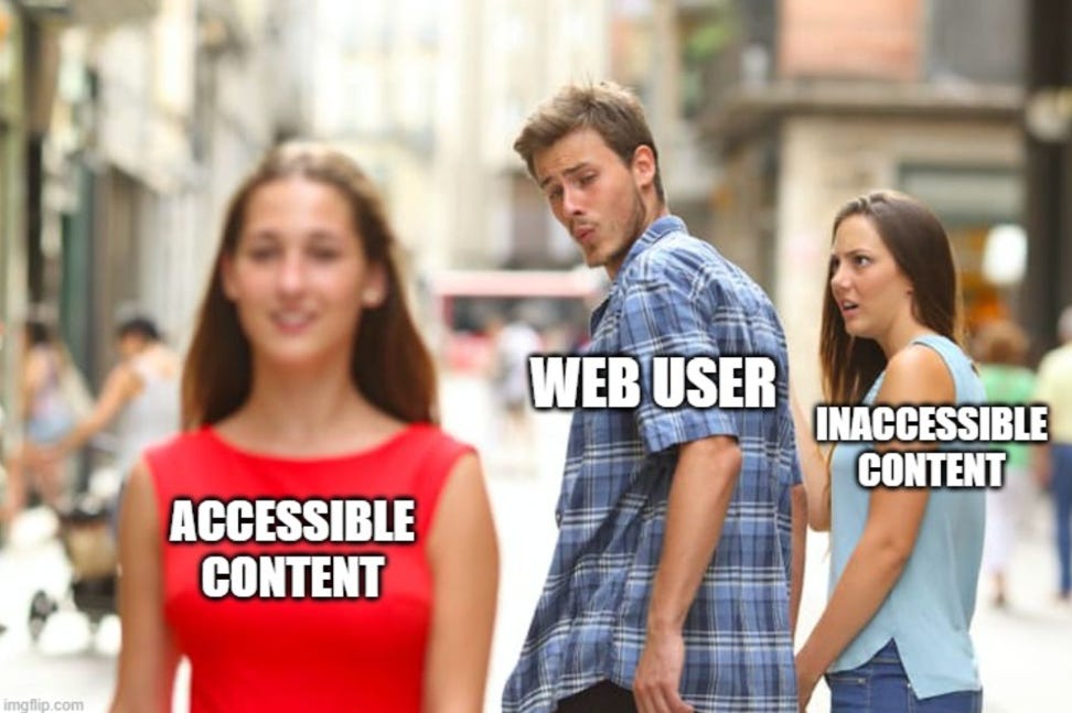
Accessibility Isn’t a Feature — It’s the Interface
Accessibility is often treated as an add-on.
Something you “check” before release. Something handled by audits. Something that only matters for a small group of users.
But accessibility isn’t a feature layered on top of your UI.
It is your UI — just experienced differently.
Every frontend app you build is used not only by mouse and touch users, but also by:
Keyboard-only users
Screen reader users
People with limited mobility
Users on low-end devices
Users in constrained environments
And increasingly, by non-human consumers like automation tools and AI agents.
The difficult part about accessibility is that most mistakes don’t break anything visibly. The UI still renders. Buttons still look clickable. The layout still appears correct.
But under the surface, the interface becomes unusable.
In this article, I’ll walk through some of the most common accessibility mistakes I’ve seen in real frontend applications — and more importantly, what to do instead.
What Accessibility Actually Means
Accessibility in frontend development means building interfaces that can be used by as many people as possible, regardless of ability, device, or context.
It’s not limited to screen readers.
Accessibility includes:
Users who rely entirely on keyboards
Users with visual, hearing, or motor impairments
Users on low-end devices or slow connections
Users in bright sunlight or noisy environments
Even automated tools and AI agents consuming your content
At it’s core, accessibility is about removing unnecessary barriers.
A button should behave like a button.
A form field should clearly communicate it’s purpose.
Navigation should be predictable.
Important information should not depend on a single sensory cue.
Accessibility is not about building separate experiences.
It’s about building one experience that works correctly.
When accessibility is treated as part of the foundation rather than a late-stage audit, many problems disappear before they ever reach users.
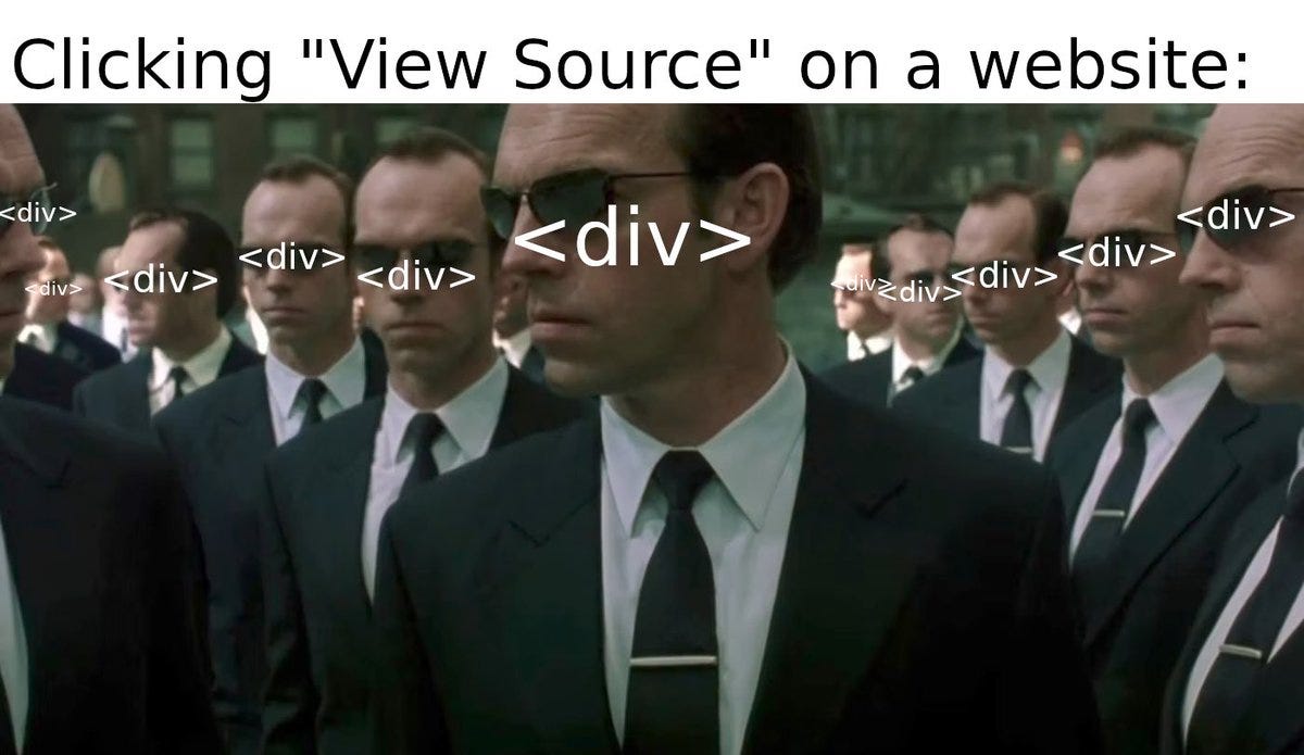
1. Using div and span for Everything
One of the most common mistakes in frontend apps is replacing semantic elements with generic containers.
Clickable divs.
Custom-styled spans acting like buttons.
Navigation wrapped in plain containers.
Visually, it works.
Functionally, it fails.
When you use a <div> instead of a <button>, you lose:
Keyboard support (Enter/Space activation)
Focus handling
Proper ARIA role
Built-in accessibility behavior
What to do instead
Use semantic HTML first.
If it’s a button, use <button>.
If it’s navigation, use <nav>.
If it’s a list, use <ul> / <ol>.
Semantic elements give you accessibility for free — and reduce the need for extra JavaScript.
ARIA should enhance native elements, not replace them.
2. Ignoring Keyboard Navigation
Many frontend apps are designed and tested exclusively with a mouse.
But keyboard navigation is not optional.
Users should be able to:
Tab through interactive elements
Activate buttons with Enter or Space keys
See where the focus currently is
A common mistake is removing the default focus outline because it “doesn’t match the design”.
This makes keyboard navigation invisible.
What to do instead
Never remove focus styles without replacing them.
If you customize focus appearance, ensure it remains:
Clearly visible
High contrast
Consistent across components
Test your app using only the keyboard for a few minutes. You’ll quickly notice what’s broken.
3. Poor Heading Structure
Headings are not just visual elements. They define document structure.
Using headings out of order (jumping from h1 to h4) or using them purely for styling disrupts screen reader navigation.
Screen reader users often navigate by heading levels. A broken hierarchy makes content confusing.
What to do instead
Maintain a logical heading structure:
One
h1per pageSequential heading levels
Use CSS for styling, not heading misuse
Structure should reflect meaning — not appearance.
4. Missing Labels on Form Inputs
Forms are one of the most frequest sources of accessibility issues.
Commons mistakes include:
Inputs without labels
Placeholder text uses as labels
Clickable text not associated with input fields
Without proper labeling, screen readers cannot describe what the input represents.
What to do instead
Always associate labels with inputs:
<label for="email">Email</label>
<input id="email" type="email" />
Placeholders are not labels. They disappear when users start typing and are not consistently read by assistive technologies.
5. Not Handling Focus in Dynamic UIs
Modern frontend apps often include:
Modals
Dropdowns
Tabs
Side panels
A common mistake is opening a modal visually but not managing focus.
Users tabbing through the page may:
Tab into background content
Get stuck
Lose context
What to do instead
When opening a modal:
Move focus into the modal
Trap focus inside it
Return focus to the trigger element when it closes
Focus management becomes even more critical in remote-controlled or keyboard-heavy environments like Smart TVs.
6. Relying Only on Color to Convey Meaning
Design systems often use color to signal:
Errors (🚨red)
Success (🟢green)
Warnings (🟡yellow)
But color alone is not enough.
Users with color vision deficiencies may not distinguish these states.
What to do instead
Combine color with:
Text labels
Icons
Patterns
Clear messaging
For example:
Instead of only a red border, add text like:
”Password must be at least 8 characters”
Meaning should never depend solely on color.
7. Not Considering Reduced Motion
Animations can improve UX — but excessive motion can cause discomfort for some users.
Many operating systems allow users to prefer reduced motion.
Ignoring this preference creates accessibility issues.
What to do instead
Respect prefers-reduced-motion:
@media (prefers-reduced-motion: reduce) {
  * {
    animation: none;
    transition: none;
  }
}
Accessibility includes sensory considerations, not just structural ones.
Conclusion: Accessibility is Engineering Discipline
Accessibility isn’t about adding extra code.
It’s about writing correct code from the start.
Most accessibility mistakes don’t happen because developers don’t care. They happen because accessibility is invisible during development. The UI looks fine, and everything “works”.
But accessibility is about who can use your product — not just whether it renders.
When you build with semantic HTML, logical structure, intentional focus management, and inclusive design, you’re not just improving accessibility. You are building:
More resilient interfaces
More predictable systems
Better UX for everyone
Stronger foundations for future features
Accessibility is not a checklist you complete.
It’s a mindset you adopt.
And like most frontend fundamentals, it quietly determines whether your app merely looks good — or actually works for real users.
If this article helped you, consider subscribing to Frontend Engineering Weekly.
I’ll be sharing:
Practical frontend lessons
Real-world engineering insights
Web, Smart TV, and modern UI topics
One article every week
No fluff. Just real engineering.
If you found the content valuable, please hit a like❤️.
If you have any questions or suggestions, please leave a comment.
Follow me on LinkedIn and DEV.to to stay updated.
Checkout my Website and GitHub for collaboration.
I hope you have a great day and a productive week!
Regards,
Aryan
👏🏼👏🏼👏🏼
Nice explaination